First Watch

A unified ordering experience, crafted with the same care that goes into every dish.

First Watch is a national restaurant chain known for its signature menu and family-owned feel. Their food ethos is grounded in each season, with ingredients thoughtfully sourced to create fresh, delicious dishes every morning. That same care showed up everywhere, except in their digital experience.

I conducted an experience audit and designed high-fidelity UX wireframes for 10+ features that shaped the new digital experience.

Role

UX Research & Design

Year

2024-2025

Team

UX Design, UI Design, Product, Development
First Watch hero

Objective, approach & outcome

Objective: Extend the restaurant experience into digital ordering

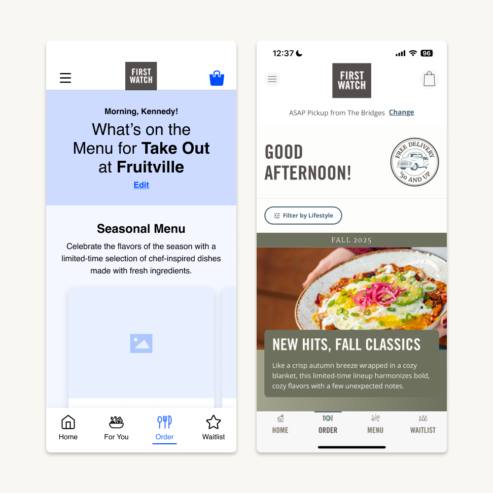
Separate white-labeled web and app platforms created a fragmented ordering journey that failed to capture the hospitality of the restaurant experience.

Divider line

Approach: A collaborative process, from research to design

This engagement was highly collaborative from discovery through delivery. I partnered closely with my UX team to conduct an experience audit, followed by the design of high-fidelity wireframes and prototypes that aligned stakeholders around a shared vision.

Throughout the process, I collaborated with product and engineering to validate scope and feasibility and engaged the UI team early to ensure alignment on the experience's more complex interactions.

This approach created space to explore multiple concepts and adapt to evolving product requirements, while keeping user needs and the brand story at the center of every design decision.

Divider line

Outcome: One brand, one experience

Online ordering and joining the waitlist both became significantly easier. Guests now recognize the brand the moment they start an order, can customize items as easily as they would in person, and can join the waitlist before they even arrive, making both the digital and in-restaurant experience smoother from end to end.

Divider line

High-fidelity wireframes

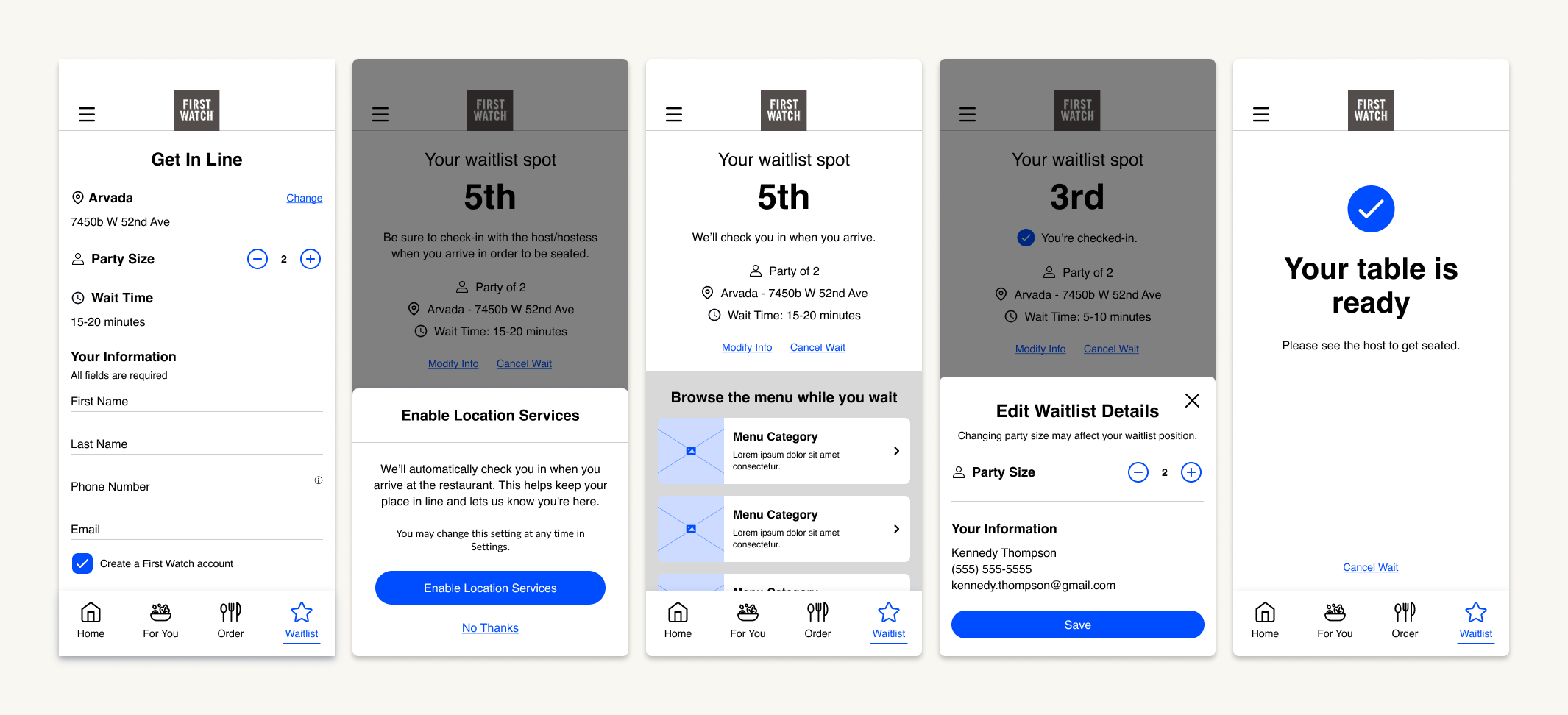
The new waitlist feature simplified the dining experience, allowing guests to join the waitlist remotely and seamlessly check in upon arrival.
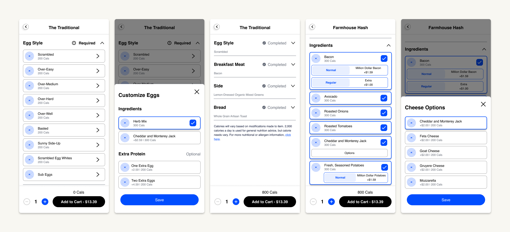
The product detail page redesign introduced a more logical ordering flow, while allowing guests to customize each dish with the same flexibility they have when ordering in restaurant.
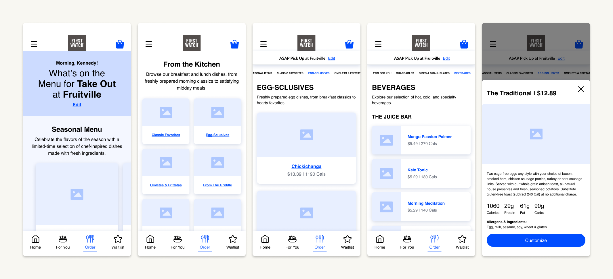
The menu redesign created a more scannable, engaging browsing experience, bringing the brand’s values to life through clear seasonal offerings and detailed nutritional information.

Popeyes’ App

Back arrow

First Watch

A unified ordering experience, crafted with the same care that goes into every dish.

First Watch is a national restaurant chain known for its signature menu and family-owned feel. Their food ethos is grounded in each season, with ingredients thoughtfully sourced to create fresh, delicious dishes every morning. That same care showed up everywhere, except in their digital experience.

I conducted an experience audit and designed high-fidelity UX wireframes for 10+ features that shaped the new digital experience.

Role

UX Research & Design

Year

2024-2025

Team

UX Design, UI Design, Product, Development

First Watch hero

Objective, approach & outcome

Objective: Extend the restaurant experience into digital ordering

Separate white-labeled web and app platforms created a fragmented ordering journey that failed to capture the hospitality of the restaurant experience.

Divider line

Approach: A collaborative process, from research to design

This engagement was highly collaborative from discovery through delivery. I partnered closely with my UX team to conduct an experience audit, followed by the design of high-fidelity wireframes and prototypes that aligned stakeholders around a shared vision.

Throughout the process, I collaborated with product and engineering to validate scope and feasibility and engaged the UI team early to ensure alignment on the experience's more complex interactions.

This approach created space to explore multiple concepts and adapt to evolving product requirements, while keeping user needs and the brand story at the center of every design decision.

Divider line

Outcome: One brand, one experience

Online ordering and joining the waitlist both became significantly easier. Guests now recognize the brand the moment they start an order, can customize items as easily as they would in person, and can join the waitlist before they even arrive, making both the digital and in-restaurant experience smoother from end to end.

Divider line

High-fidelity wireframes

The new waitlist feature simplified the dining experience, allowing guests to join the waitlist remotely and seamlessly check in upon arrival.

The product detail page redesign introduced a more logical ordering flow, while allowing guests to customize each dish with the same flexibility they have when ordering in restaurant.

The menu redesign created a more scannable, engaging browsing experience, bringing the brand’s values to life through clear seasonal offerings and detailed nutritional information.

Popeyes’ App

Back arrow
Back arrow

Home

First Watch

A unified ordering experience, crafted with the same care that goes into every dish.

First Watch is a national restaurant chain known for its signature menu and family-owned feel. Their food ethos is grounded in each season, with ingredients thoughtfully sourced to create fresh, delicious dishes every morning. That same care showed up everywhere, except in their digital experience.

I conducted an experience audit and designed high-fidelity UX wireframes for 10+ features that shaped the new digital experience.

Divider line

Role

UX Research & Design

Divider line

Year

2024-2025

Divider line

Team

UX Design, UI Design, Product, Development

Divider line
First Watch hero

Objective, approach & outcome

Objective: Extend the restaurant experience into digital ordering

Separate white-labeled web and app platforms created a fragmented ordering journey that failed to capture the hospitality of the restaurant experience.

Divider line

Approach: A collaborative process, from research to design

This engagement was highly collaborative from discovery through delivery. I partnered closely with my UX team to conduct an experience audit, followed by the design of high-fidelity wireframes and prototypes that aligned stakeholders around a shared vision.

Throughout the process, I collaborated with product and engineering to validate scope and feasibility and engaged the UI team early to ensure alignment on the experience's more complex interactions.

This approach created space to explore multiple concepts and adapt to evolving product requirements, while keeping user needs and the brand story at the center of every design decision.

Divider line

Outcome: One brand, one experience

Online ordering and joining the waitlist both became significantly easier. Guests now recognize the brand the moment they start an order, can customize items as easily as they would in person, and can join the waitlist before they even arrive, making both the digital and in-restaurant experience smoother from end to end.

Divider line

High-fidelity wireframes

The new waitlist feature simplified the dining experience, allowing guests to join the waitlist remotely and seamlessly check in upon arrival.

The product detail page redesign introduced a more logical ordering flow, while allowing guests to customize each dish with the same flexibility they have when ordering in restaurant.

The menu redesign created a more scannable, engaging browsing experience, bringing the brand’s values to life through clear seasonal offerings and detailed nutritional information.

Popeyes’ App

Back arrow