Popeyes

A custom app experience, designed to drive craveability and confidence in every order.

Popeyes is a multinational restaurant chain known for their unique New Orleans-style menu. The existing platform could no longer support its evolving product roadmap, creating an opportunity to redesign the end-to-end ordering experience with a more scalable foundation that better reflected the brand.

I owned key UX design deliverables, conducting an experience audit, mapping user flows, and creating high-fidelity wireframes and prototypes.

Role

UX Research & Design

Year

2023-2024

Team

UX Design, UI Design, Product
Popeyes hero

Objective, approach & outcome

Objective: Redesign the experience to enable fast, accurate ordering

Friction points at key moments in the ordering flow created opportunities to simplify the experience and improve conversion.

Divider line

Approach: A research-led redesign

I kicked off the engagement with an experience audit, combining analytics data with a review of the existing ordering journey to identify key friction points and opportunities across the app. I also reviewed findings from 60 usability tests to better understand customer pain points and usability gaps. Together, these insights helped prioritize the product roadmap.

Each feature started with a product workshop to define requirements. From there, I created user flows, high-fidelity wireframes, and prototypes, grounding design decisions in research, business objectives, and technical considerations. Throughout the process, I collaborated closely with client stakeholders and development teams to align on solutions and validate feasibility, while partnering with the UI team to ensure a smooth transition from UX wireframes to final UI designs.

Divider line

Outcome: A best-in-class app experience driving AOV

The redesigned app increased average order value by 5% and streamlined the ordering flow across 8 features, creating a faster, more intuitive experience for guests.

Divider line

High-fidelity wireframes

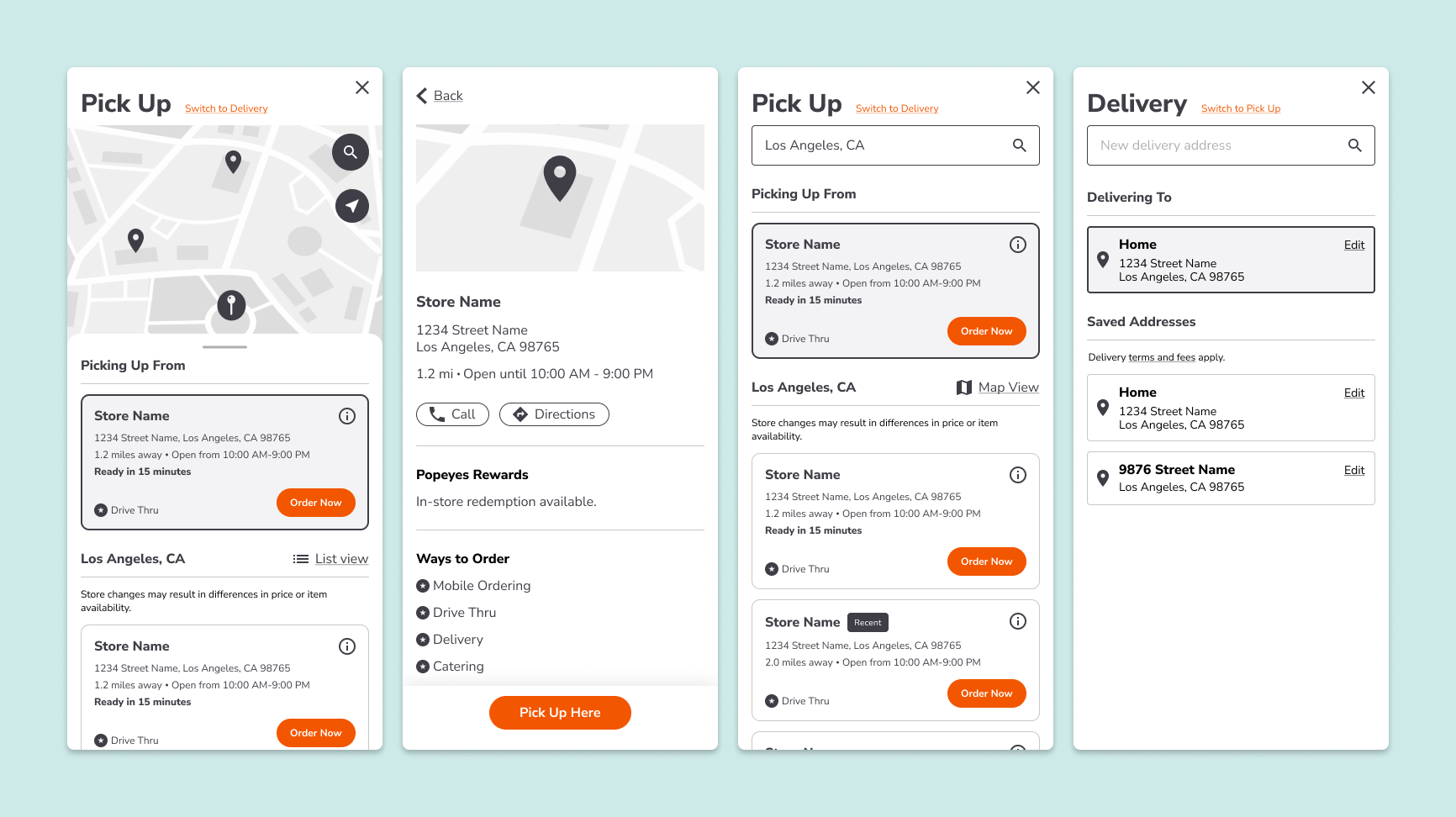
The new location selection process reduced unnecessary clicks, surfaced relevant location details, and reinforced the selected fulfillment method.
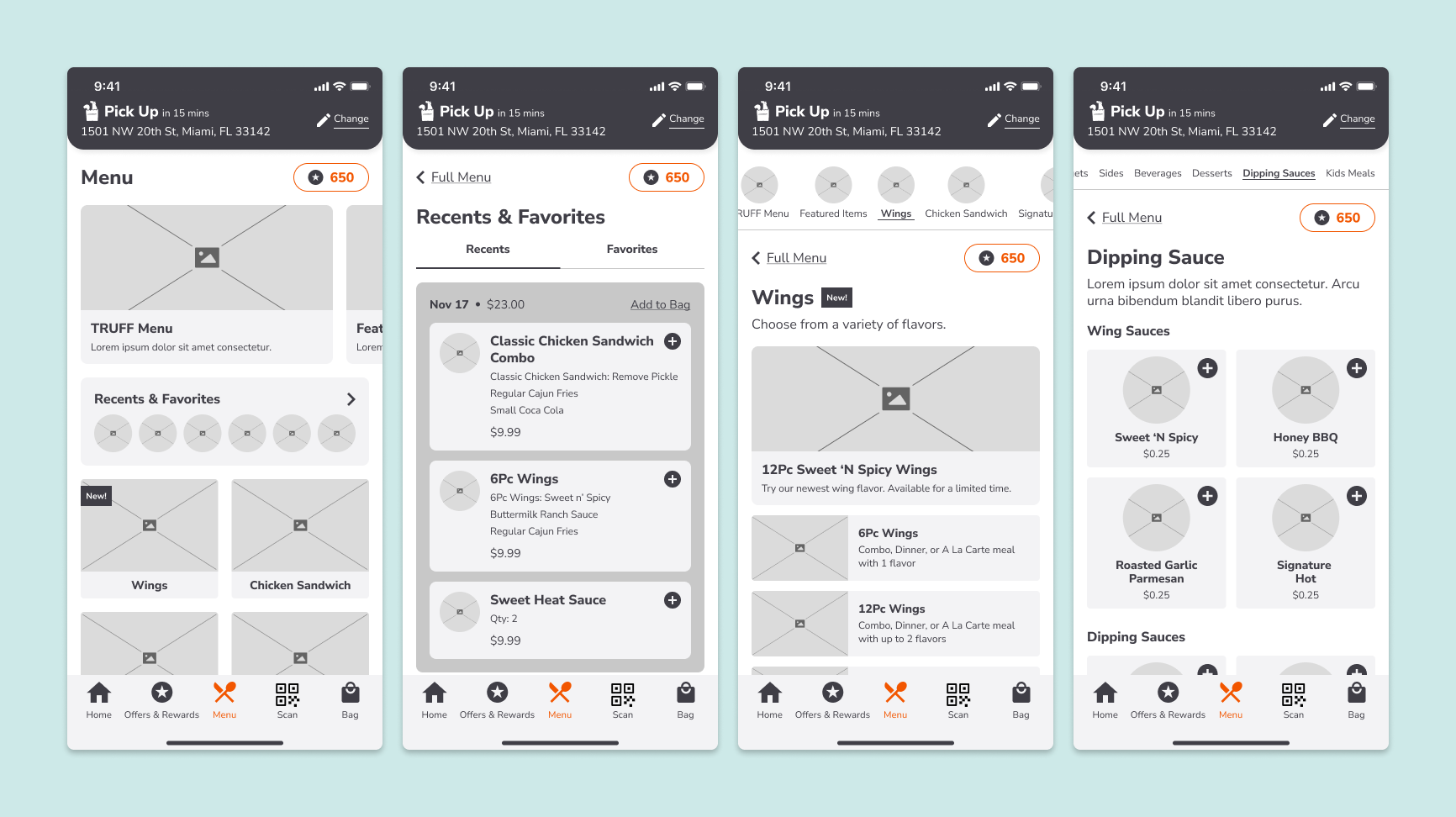
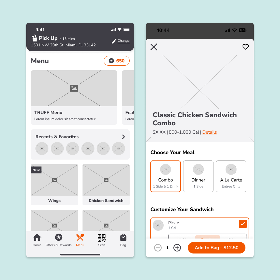
The menu redesign created a more visual, streamlined browsing experience by integrating recent items, simplifying navigation to two levels, and introducing quick add for simple items.
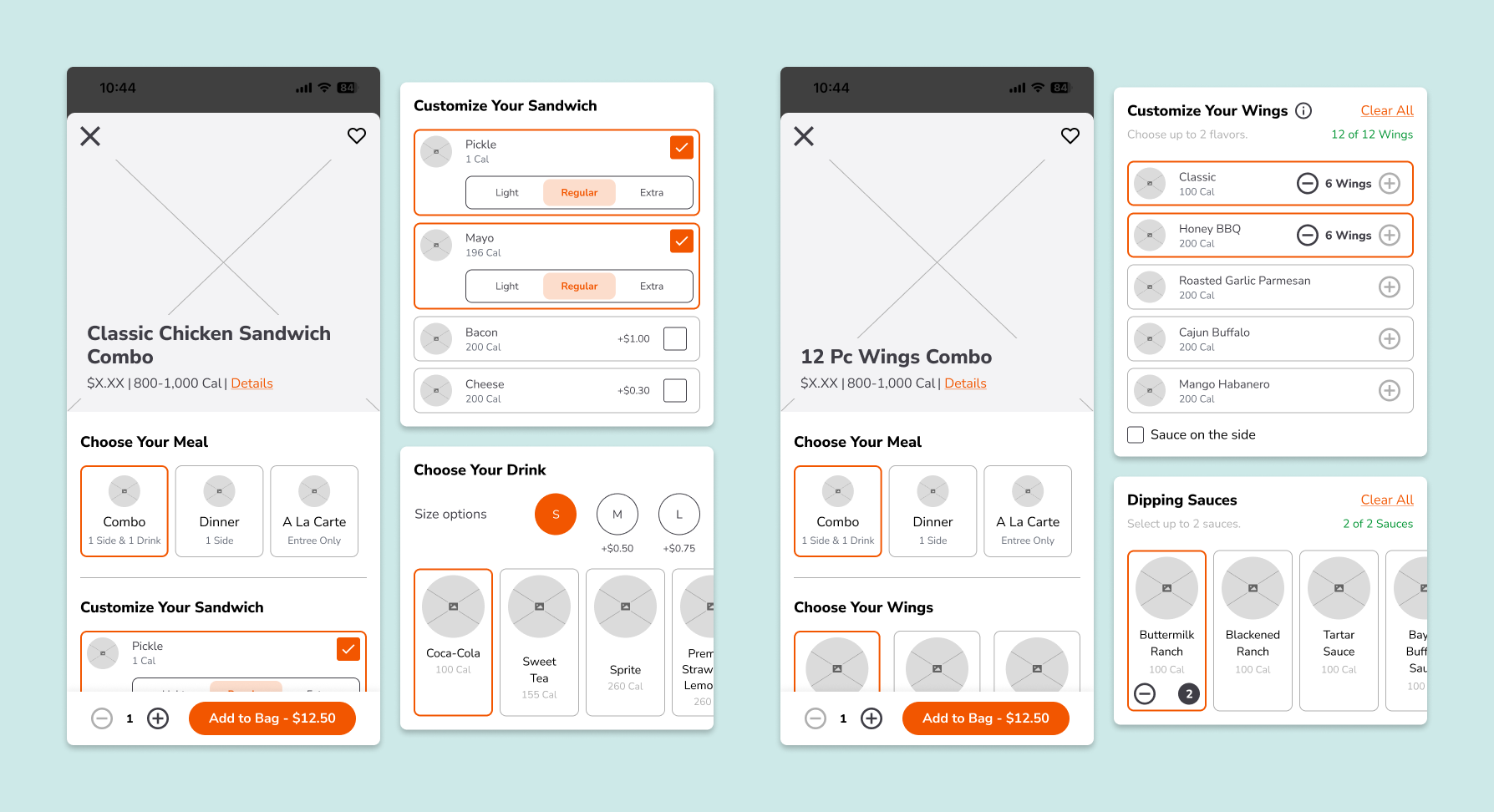
The product detail page balanced speed and flexibility by maintaining popular pre-selected configurations, establishing a flexible customization framework that supported a range of products, and enabling thoughtful upsell opportunities.
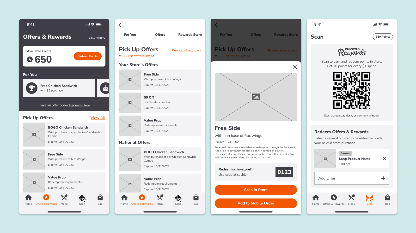
The offers and rewards experience improved offer discovery by highlighting personalized rewards, creating a more scannable offer layout, and tailoring available promotions to each guest’s order journey.

UnitedHealthcare Community & State’s Homepage

Back arrow

Popeyes

A custom app experience, designed to drive craveability and confidence in every order.

Popeyes is a multinational restaurant chain known for their unique New Orleans-style menu. The existing platform could no longer support its evolving product roadmap, creating an opportunity to redesign the end-to-end ordering experience with a more scalable foundation that better reflected the brand.

I owned key UX design deliverables, conducting an experience audit, mapping user flows, and creating high-fidelity wireframes and prototypes.

Role

UX Research & Design

Year

2023-2024

Team

UX Design, UI Design, Product

Popeyes hero

Objective, approach & outcome

Objective: Redesign the experience to enable fast, accurate ordering

Friction points at key moments in the ordering flow created opportunities to simplify the experience and improve conversion.

Divider line

Approach: A research-led redesign

I kicked off the engagement with an experience audit, combining analytics data with a review of the existing ordering journey to identify key friction points and opportunities across the app. I also reviewed findings from 60 usability tests to better understand customer pain points and usability gaps. Together, these insights helped prioritize the product roadmap.

Each feature started with a product workshop to define requirements. From there, I created user flows, high-fidelity wireframes, and prototypes, grounding design decisions in research, business objectives, and technical considerations. Throughout the process, I collaborated closely with client stakeholders and development teams to align on solutions and validate feasibility, while partnering with the UI team to ensure a smooth transition from UX wireframes to final UI designs.

Divider line

Outcome: A best-in-class app experience driving AOV

The redesigned app increased average order value by 5% and streamlined the ordering flow across 8 features, creating a faster, more intuitive experience for guests.

Divider line

High-fidelity wireframes

The new location selection process reduced unnecessary clicks, surfaced relevant location details, and reinforced the selected fulfillment method.

The menu redesign created a more visual, streamlined browsing experience by integrating recent items, simplifying navigation to two levels, and introducing quick add for simple items.

The product detail page balanced speed and flexibility by maintaining popular pre-selected configurations, establishing a flexible customization framework that supported a range of products, and enabling thoughtful upsell opportunities.

The offers and rewards experience improved offer discovery by highlighting personalized rewards, creating a more scannable offer layout, and tailoring available promotions to each guest’s order journey.

UnitedHealthcare Community & State’s Homepage

Back arrow
Back arrow

Home

Popeyes

A custom app experience, designed to drive craveability and confidence in every order.

Popeyes is a multinational restaurant chain known for their unique New Orleans-style menu. The existing platform could no longer support its evolving product roadmap, creating an opportunity to redesign the end-to-end ordering experience with a more scalable foundation that better reflected the brand.

I owned key UX design deliverables, conducting an experience audit, mapping user flows, and creating high-fidelity wireframes and prototypes.

Divider line

Role

UX Research & Design

Divider line

Year

2023-2024

Divider line

Team

UX Design, UI Design, Product

Divider line
Popeyes hero

Objective, approach & outcome

Objective: Redesign the experience to enable fast, accurate ordering

Friction points at key moments in the ordering flow created opportunities to simplify the experience and improve conversion.

Divider line

Approach: A research-led redesign

I kicked off the engagement with an experience audit, combining analytics data with a review of the existing ordering journey to identify key friction points and opportunities across the app. I also reviewed findings from 60 usability tests to better understand customer pain points and usability gaps. Together, these insights helped prioritize the product roadmap.

Each feature started with a product workshop to define requirements. From there, I created user flows, high-fidelity wireframes, and prototypes, grounding design decisions in research, business objectives, and technical considerations. Throughout the process, I collaborated closely with client stakeholders and development teams to align on solutions and validate feasibility, while partnering with the UI team to ensure a smooth transition from UX wireframes to final UI designs.

Divider line

Outcome: A best-in-class app experience driving AOV

The redesigned app increased average order value by 5% and streamlined the ordering flow across 8 features, creating a faster, more intuitive experience for guests.

Divider line

High-fidelity wireframes

Location selection wireframes

The new location selection process reduced unnecessary clicks, surfaced relevant location details, and reinforced the selected fulfillment method.

Menu wireframes

The menu redesign created a more visual, streamlined browsing experience by integrating recent items, simplifying navigation to two levels, and introducing quick add for simple items.

PDP wireframes

The product detail page balanced speed and flexibility by maintaining popular pre-selected configurations, establishing a flexible customization framework that supported a range of products, and enabling thoughtful upsell opportunities.

Offers wireframes

The offers and rewards experience improved offer discovery by highlighting personalized rewards, creating a more scannable offer layout, and tailoring available promotions to each guest’s order journey.

UnitedHealthcare Community & State’s Homepage

Back arrow