Back arrow

Home

UnitedHealthcare Community & State

A homepage built to be trusted.

UnitedHealthcare Community & State partners with state leaders, policymakers, and Medicaid program leaders to deliver government-sponsored health care solutions.

The existing homepage didn't effectively support this audience, prompting a content refresh that evolved into a broader homepage redesign.

I led all UX & UI design work, partnering closely with cross-functional teams at every phase.

Role

UX & UI Design

Year

2026

Team

Content Strategy, Copywriting, Product, Development
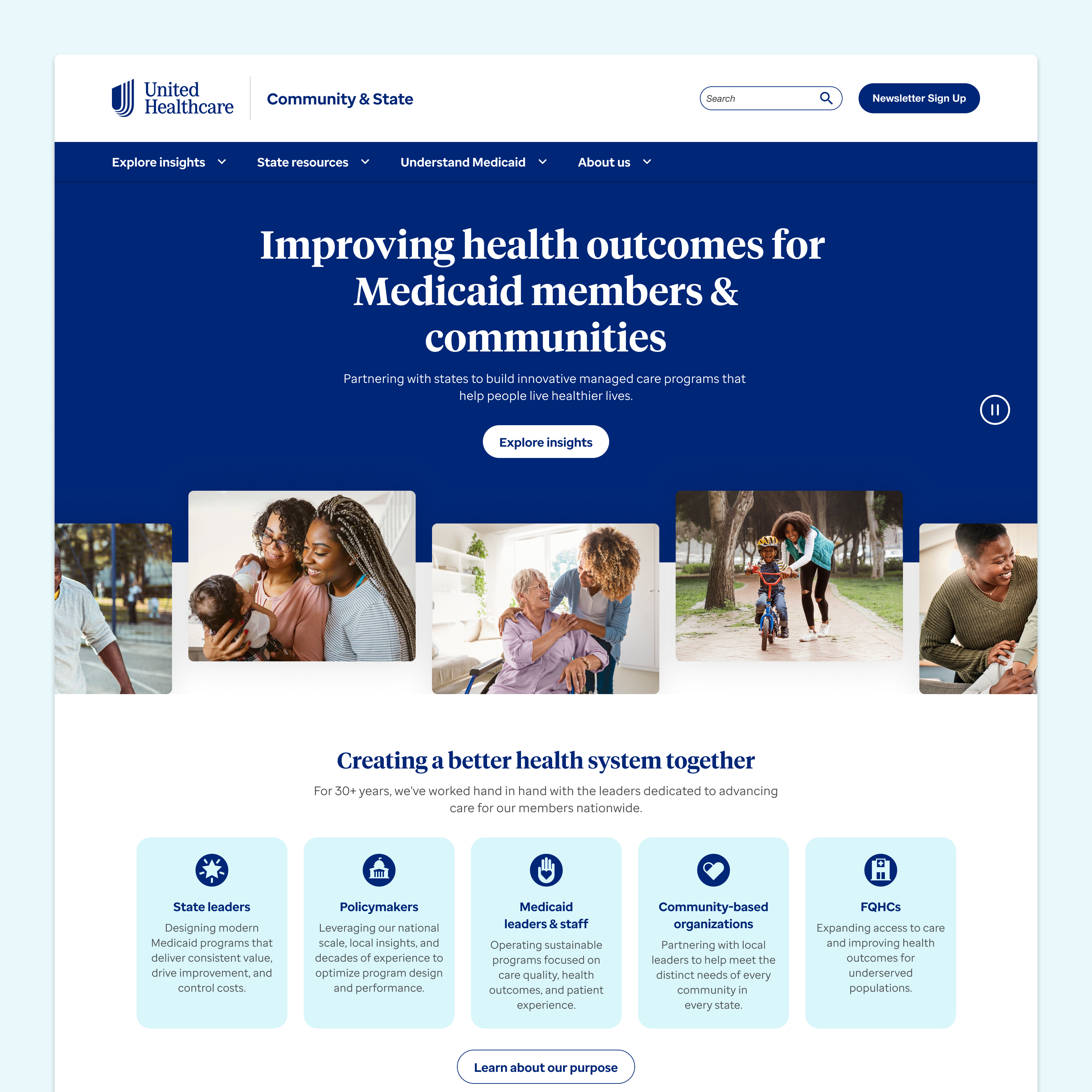
UHCCS hero

Objective, approach & impact

Objective: Align the homepage with its intended audience

The homepage lacked a clear value proposition, surfaced thought leadership with little context, and offered no clear next step. Underlying these issues was a more fundamental problem: it wasn't clear who the site was for. It read as though it served Medicaid consumers, when its intended audience is state and Medicaid leaders.

Divider line

Approach: A cross-functional effort, led by content and design

This project moved through three phases: content strategy, design, and development. My work began by supporting the content strategy phase with a low-fidelity wireframe that generated stakeholder interest in expanding the effort into a larger redesign.

From there, I led UX & UI design for the new homepage, with support from another designer, introducing a new visual design while staying grounded in the brand's established identity.

Throughout the design process, I worked closely with product and engineering to strategically leverage the existing component library where possible. Rather than developing a new set of components, we refined those already in production to keep the development effort as light as possible without compromising the quality of the final design.

During development, I conducted visual QA to ensure the final build matched the design, and helped plan a phased rollout to manage scope and technical constraints.

Divider line

Impact: Establishing credibility to drive engagement

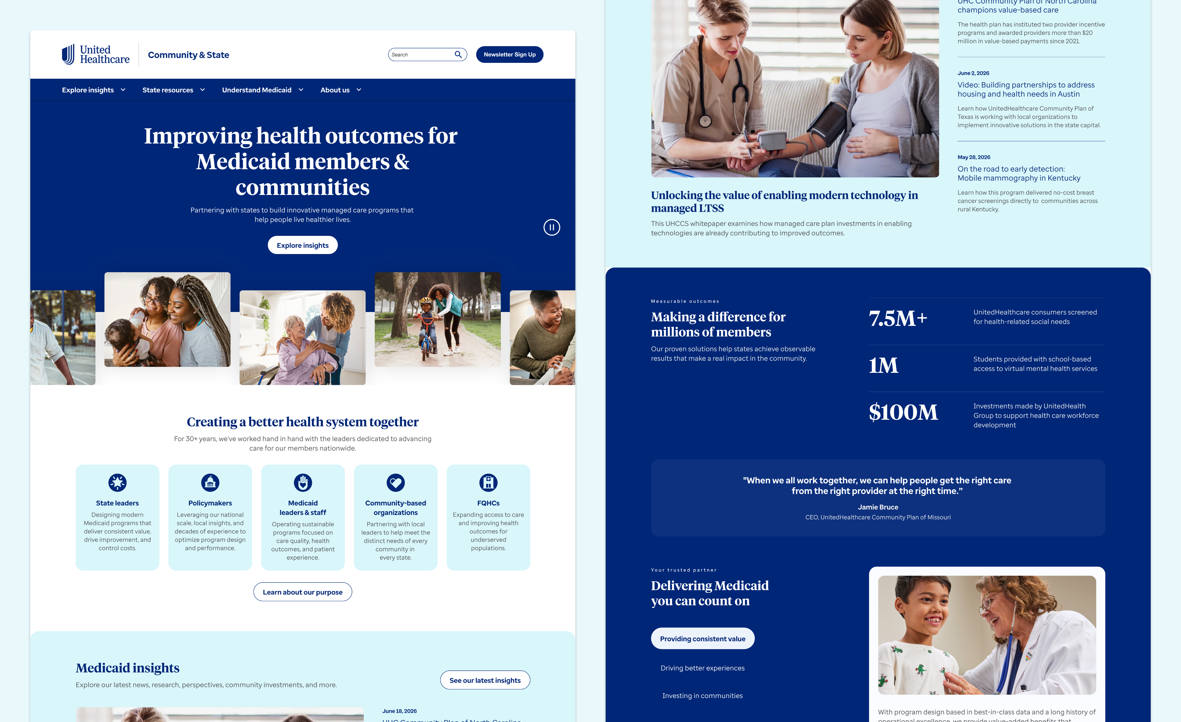
Our approach paid off, with the new homepage launching within weeks of final design approval. It now leads with a clear value proposition and surfaces thought leadership with context, both working together to establish credibility with visitors. From there, clear calls to action guide them deeper into the site, driving stronger engagement.

Beyond the page itself, the redesign has established a refreshed content strategy and visual direction for the broader digital experience, creating excitement and momentum for the next phase of work.

Divider line

First Watch’s Digital Ordering Experience

Back arrow
Back arrow

Home

UnitedHealthcare Community & State

A homepage built to be trusted.

UnitedHealthcare Community & State partners with state leaders, policymakers, and Medicaid program leaders to deliver government-sponsored health care solutions.

The existing homepage didn't effectively support this audience, prompting a content refresh that evolved into a broader homepage redesign.

I led all UX & UI design work, partnering closely with cross-functional teams at every phase.

Role

UX & UI Design

Year

2026

Team

Content Strategy, Copywriting, Product, Development

UHCCS hero

Objective, approach & impact

Objective: Align the homepage with its intended audience

The homepage lacked a clear value proposition, surfaced thought leadership with little context, and offered no clear next step. Underlying these issues was a more fundamental problem: it wasn't clear who the site was for. It read as though it served Medicaid consumers, when its intended audience is state and Medicaid leaders.

Divider line

Approach: A cross-functional effort, led by content and design

This project moved through three phases: content strategy, design, and development. My work began by supporting the content strategy phase with a low-fidelity wireframe that generated stakeholder interest in expanding the effort into a larger redesign.

From there, I led UX & UI design for the new homepage, with support from another designer, introducing a new visual design while staying grounded in the brand's established identity.

Throughout the design process, I worked closely with product and engineering to strategically leverage the existing component library where possible. Rather than developing a new set of components, we refined those already in production to keep the development effort as light as possible without compromising the quality of the final design.

During development, I conducted visual QA to ensure the final build matched the design, and helped plan a phased rollout to manage scope and technical constraints.

Divider line

Impact: Establishing credibility to drive engagement

Our approach paid off, with the new homepage launching within weeks of final design approval. It now leads with a clear value proposition and surfaces thought leadership with context, both working together to establish credibility with visitors. From there, clear calls to action guide them deeper into the site, driving stronger engagement.

Beyond the page itself, the redesign has established a refreshed content strategy and visual direction for the broader digital experience, creating excitement and momentum for the next phase of work.
Divider line

First Watch’s Digital Ordering Experience

Back arrow
Back arrow

Home

UnitedHealthcare Community & State

A homepage built to be trusted.

UnitedHealthcare Community & State partners with state leaders, policymakers, and Medicaid program leaders to deliver government-sponsored health care solutions.

The existing homepage didn't effectively support this audience, prompting a content refresh that evolved into a broader homepage redesign.

I led all UX & UI design work, partnering closely with cross-functional teams at every phase.

Divider line

Role

UX & UI Design

Divider line

Year

2026

Divider line

Team

Content Strategy, Copywriting, Product, Development

Divider line
UHCCS hero

Objective, approach & impact

Objective: Align the homepage with its intended audience

The homepage lacked a clear value proposition, surfaced thought leadership with little context, and offered no clear next step. Underlying these issues was a more fundamental problem: it wasn't clear who the site was for. It read as though it served Medicaid consumers, when its intended audience is state and Medicaid leaders.

Divider line

Approach: A cross-functional effort, led by content and design

This project moved through three phases: content strategy, design, and development. My work began by supporting the content strategy phase with a low-fidelity wireframe that generated stakeholder interest in expanding the effort into a larger redesign.

From there, I led UX & UI design for the new homepage, with support from another designer, introducing a new visual design while staying grounded in the brand's established identity.

Throughout the design process, I worked closely with product and engineering to strategically leverage the existing component library where possible. Rather than developing a new set of components, we refined those already in production to keep the development effort as light as possible without compromising the quality of the final design.

During development, I conducted visual QA to ensure the final build matched the design, and helped plan a phased rollout to manage scope and technical constraints.

Divider line

Impact: Establishing credibility to drive engagement

Our approach paid off, with the new homepage launching within weeks of final design approval. It now leads with a clear value proposition and surfaces thought leadership with context, both working together to establish credibility with visitors. From there, clear calls to action guide them deeper into the site, driving stronger engagement.

Beyond the page itself, the redesign has established a refreshed content strategy and visual direction for the broader digital experience, creating excitement and momentum for the next phase of work.

Divider line

First Watch’s Digital Ordering Experience

Back arrow